Deriving information from data can be a big challenge. In this post, we will learn how to create a simple data visualization using d3.js. Moreover, we will try to understand the basic concepts under this amazing library as well as go through a brief overview of javascript, css, and svg.
An old and common approach to retrieve information from data is to use report files such as PDF, XLS, or static charts. However, the power of computers today is infinitely greater than that of computers 15 years ago. Therefore, there are many new ways to look at data. Although the power of computers has significantly increased, the size of screens has remained the same and hasn't kept up with the improvements of other components such as processors, memories, and secondary memories. In other words, utilizing the inifinite power of computers inside screens of such small and stagnant sizes can prove to be a real challenge.
D3.js is a javascript library for manipulating documents based on data. This is a description from its creator, Mike Bostock:
D3.js is a JavaScript library for manipulating documents based on data. D3 helps you bring data to life using HTML, SVG, and CSS. D3’s emphasis on web standards gives you the full capabilities of modern browsers without tying yourself to a proprietary framework, combining powerful visualization components and a data-driven approach to DOM manipulation.
So, let's get started!
For this post, we are using a public dataset from the 2014 World Cup which has information about players that participted in this World Cup. You can download it here. Basically, the dataset has the following information on each player:
| Player | String | Player’s name. |
| Age | Int | Player’s age. |
| Captain | Int | Value (1 or 0) indicates whether the player is a captain. |
| Club | String | The player’s club when not playing for the national team in the World Cup. |
| Country | String | The country the player represents in the World Cup. |
| Group | String | The player’s national team belongs to this World Cup group. |
| Jersey | Int | The player’s jersey number. |
| Position | String | The player’s position. |
| Rank | Int | The ranking of the country the player represents. |
| Selections | Int | The number of World Cup appearances for this player. |
Before we start, we need to clean up our data set since the entire set of data would be an overload for our little 1200x900 screen. In order to clean our dataset, we can remove countries that weren't top performers, so that the remaining countries are: Brazil (Vai Brasil!), Spain, Colombia, Uruguay, France, Argentina, Germany and Belgium. The cleaned dataset can be downloaded here.
The first step to understanding what a data visualization is and how it works through the web is to understand how html, javascript, css, and svg can work together to collect data and show it properly. Here is a quick review of what html, javascript, css and svg are:
Web browsers receive HTML documents from a webserver or from local storage and render them into multimedia web pages. HTML describes the structure of a web page semantically and includes cues for the appearance of the document.
JavaScript is a high-level, dynamic, weakly typed, object-based, multi-paradigm, and interpreted client-side programming language.
Cascading Style Sheets (CSS) is a style sheet language used for describing the presentation of a document written in a markup language.
Scalable Vector Graphics (SVG) is an XML-based vector image format for two-dimensional graphics with support for interactivity and animation. The SVG specification is an open standard developed by the World Wide Web Consortium (W3C) since 1999.
Basically, we need to get data using javascript functions and create an svg graphic inside the html. We can also utilize css to make it clear and stylish. Fortunately d3.js already has a lot of functions to help us do all of this.
So, the first step is to create a html file from scratch and include the d3.js library like this:
<script src="https://d3js.org/d3.v3.min.js"></script>
var margin = {top: 20, right: 20, bottom: 30, left: 40},
    width = 960 - margin.left - margin.right,
    height = 500 - margin.top - margin.bottom;
var x = d3.scale.linear(),
    .range([0, width]);

var y = d3.scale.linear()
    .range([height, 0]);
We just defined a linear scale for x and y with the size of our width and height predefined. d3.js has several types of scales, which you can check out here. Once our scales are done, let's create the axis with the proper orientation:
var xAxis = d3.svg.axis()
   .scale(x)
   .orient("bottom");

var yAxis = d3.svg.axis()
   .scale(y)
   .orient("left");
Last but not least, we need create the svg and attach it to the body. d3.js has a method for attaching elements into the DOM. We need to select which part of the page we want to attach with our element, and then create the element. The code to do that is:
var svg = d3.select("body")
  .append("svg")
   .attr("width", width + margin.left + margin.right)
   .attr("height", height + margin.top + margin.bottom)
  .append("g")
   .attr("transform", "translate(" + margin.left + "," + margin.top + ")");
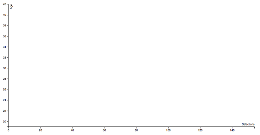
We are selecting the element "body" and attaching a "svg" element inside it with width and height as attributes. We are also attaching a "g" element with a transform attribute into the "svg". If you open the page now, you will be able to see something like this:
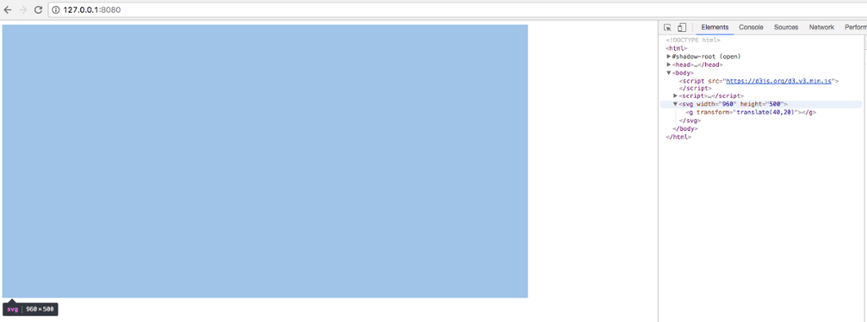
The svg was successfully attached to our body and the g element is there under the svg. So far so good!
Before we continue, let's create another scale using colors. It will be useful to be able to identify each country in terms of colors in our graphic. This function basically generates 10 random colors to be consumed by any property that we assign, so just add this line above the svg creation:
var color = d3.scale.category10();
The next step is to get the data and add our visualization inside the svg element. The d3.js library has a lot of functions that allow the consumption of data from a lot of sources, like csv, json, and tsv. For this post, we are using tsv and can properly load the data like so:
d3.tsv("worldcup.tsv", function(error, data) {
  if (error) throw error;
});
data.forEach(function(d) {
  d.Age = +d.Age;
  d.Selections = +d.Selections;
});
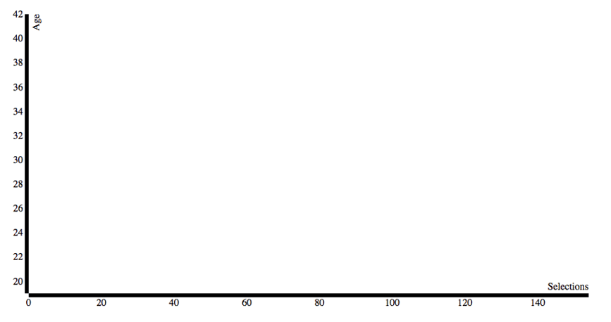
x.domain(d3.extent(data, function(d) { return d.Selections; }));
y.domain(d3.extent(data, function(d) { return d.Age; }));
svg.append("g")
  .attr("class", "x axis")
  .attr("transform", "translate(0," + height + ")")
  .call(xAxis)
 .append("text")
  .attr("class", "label")
  .attr("x", width)
  .attr("y", -6)
  .style("text-anchor", "end")
  .text("Selections");

svg.append("g")
   .attr("class", "y axis")
  .call(yAxis)
   .append("text")
   .attr("class", "label")
   .attr("transform", "rotate(-90)")
   .attr("y", 6)
   .attr("dy", ".71em")
   .style("text-anchor", "end")
   .text("Age");
body {
    font: 10px sans-serif;
}

.axis path,
.axis line {
    fill: none;
    stroke: #000;
    shape-rendering: crispEdges;
}
svg.selectAll(".dot")
    .data(data)
  .enter().append("circle")
    .attr("class", "dot")
    .attr("r", 6.5)
    .attr("cx", function(d) { return x(d.Selections); })
    .attr("cy", function(d) { return y(d.Age); })
    .attr("fill", function(d, i) {
       return color(d.Country);
    });
.dot {
    stroke: #000;
}
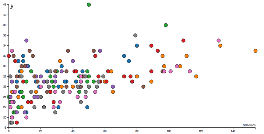
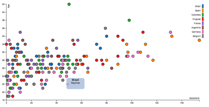
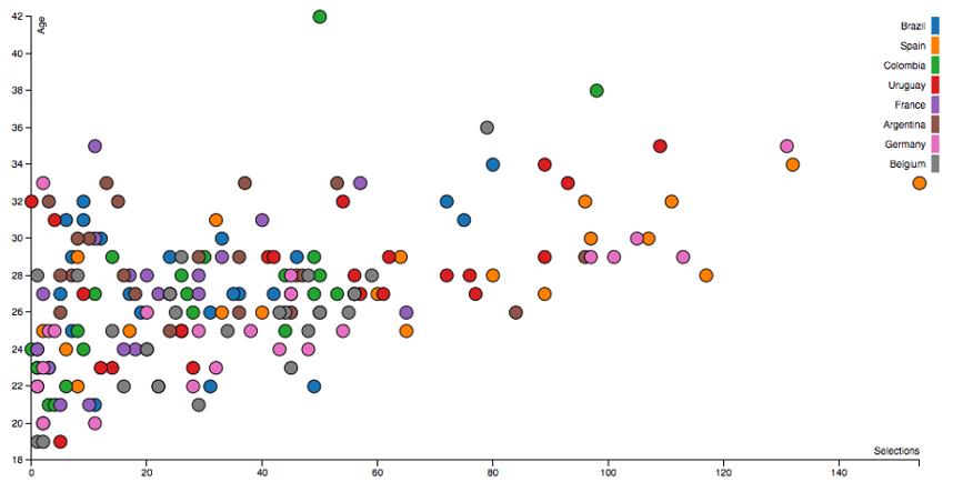
We now have a colored static graphic which gives us a visual interpretation of the players. However, we don't know much about this graphic because we have no idea what each color represents. So, we need to create a legend. We can do so using the same approach as before. We can select and apply the data and then create the box and the legend text like this:
var legend = svg.selectAll(".legend")
   .data(color.domain())
  .enter().append("g")
   .attr("class", "legend")
   .attr("transform", function(d, i) { return "translate(30," + i * 20 + ")"; });

legend.append("rect")
   .attr("x", width - 18)
   .attr("width", 18)
   .attr("height", 18)
   .style("fill", color);

legend.append("text")
   .attr("x", width - 24)
   .attr("y", 9)
   .attr("dy", ".35em")
   .style("text-anchor", "end")
   .text(function(d) { return d; });
var div = d3.select("body").append("div")
    .attr("class", "tooltip")
    .style("opacity", 0);
div.tooltip {
   position: absolute;
   text-align: center;
   width: 80px;
   height: 48px;
   padding: 2px;
   font: 12px sans-serif;
   background: lightsteelblue;
   border: 0px;
   border-radius: 8px;
   pointer-events: none;
}
svg.selectAll(".dot")
    .data(data)
  .enter().append("circle")
    .attr("class", "dot")
    .attr("r", 6.5)
    .attr("cx", function(d) { return x(d.Selections); })
    .attr("cy", function(d) { return y(d.Age); })
    .attr("fill", function(d, i) {
       return color(d.Country);
    })
   .on("mouseover", function(d, i) {
      d3.select(this)
        .attr("fill", "red");

      div.transition()
        .duration(200)
        .style("opacity", .9);

      div .html("<b>" + d.Country + "</b><br/>" + d.Player)
        .style("left", (d3.event.pageX) + "px")
       .style("top", (d3.event.pageY - 28) + "px");
    })
    .on("mouseout", function(d, i) {
      d3.select(this)
        .attr("fill", function() {
           return color(d.Country);
         });

     div.transition()
        .duration(500)
        .style("opacity", 0);
     });