
In this new era of information, there's an increasing need to understand the latest trends quickly and efficiently, which means there's also a need for meaningful sources of trustworthy information.
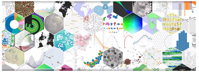
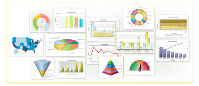
This is where data visualization comes in. Data visualization is the art of displaying information by combining the beauty of imagery with the conciseness of statistics, which allows us to organize complex data into convenient graphical representations. In simple terms, data visualization is the art of translating complex data into meaningful information.

In order for a piece of art to be beautiful, it needs to have some structure. The same is true for data visualization. One requirement of data visualization is ensuring that the data is well-cleaned and formatted. With that in mind, let's move on to the next section.
Data Cleaning
Typically before using data visualization software, it's necessary to clean data. What does that mean? It means that in order to format the data, it must be standardized so that it can be properly processed.
For instance, in your data, you might have terms like "San Francisco", "San Fran", or "The City By the Bay", which would be treated as different entries when they're actually referring to the same city. Therefore, data cleaning is an important step for prepping data and accurately shaping it into standard formats so that it can be correctly analyzed and produce meaningful results.
Here's a list of some data cleaning tools that can help with this:
Data Wrangler & Trifacta Data Wrangler
DataWrangler was created by Stanford University's visualization group, and is a web-based data wrangling service that offers an interactive method for data cleaning and transformation. This means you can clean your data using their web platform and transform messy, real-world data into organized data tables with accuracy.
This project has been completed and no longer actively supported, but is still available for use. From this project, a commercial venture called Trifacta Wrangler was created. Although still in beta, Trifecta Wrangler is a desktop software that delivers the same results, but with more features. Its free license allows users to import from local CSV, Json, text, and Excel files.
Learn more: There are many materials, such as video tutorials, that can be found on the DataWrangler webpage as well as from Trifecta's resource page.
Drake
Drake is more than a simple data cleansing tool. It's a data workflow tool that's able to manage and organize the whole process of data manipulation, starting from cleaning, all the way to delivering data to be consumed by visualization software.
For instance, it allows you to create workflows to process data that could automate the following steps:
-defining file locations for input and output
-converting data files into proper extension formats
-unifying multiple sources into a single one
-ensuring that every new data file change is reflected on the single unified file, as well as documenting it properly on a Wiki
Learn more: There are extensive documents, and even a walk-through video, on the Drake main webpage.
OpenRefine
Formerly known as Google Refine, OpenRefine is also another tool that offers data cleansing, transformation, and augmentation from data lying on the web. It offers the ability to perform advanced operations that have their own expression language. It's an open project that has been actively supported on GitHub and features many built-in algorithms that help find text items that can be grouped together. Once your data is imported, these cell-clustering algorithms can be found by selecting 'edit cells', then 'cluster', and then 'edit'. Once an option is chosen, you can decide whether to accept or reject the suggestions. Besides cleaning, OpenRefine also offers analysis tools such as filtering and sorting.
Check out the project main webpage to see helpful tutorials, a discussion list, and comprehensive documentation. There are also some demo screencasts, and even a book called Using OpenRefine. Together, these provide a great introduction to the tool.
Data Visualization Tools
There are a plethora of free data visualization tools out there on the web, but I've narrowed them down to tools that are free and/or supported by an active community. Let's take a look at these useful and free tools that empower us with data visualization benefits:
For Developers
D3.js
D3.js is one of the first data visualization tools that comes to mind when talking about free, open-source alternatives. It's a javascript based library for creating web visualization and displays the results on the web page. However, with great power comes great responsibility. D3.js is extremely powerful and flexible, because it allows you to build amazing things with it, but as a trade-off, it's not the easiest tool to use, so you might need to spend some time going through the helpful library documentation. The good thing is that D3.js has extensive documentation, as well as a myriad of nice use-cases based on D3.js as examples. Here is a cool example that shows the intricate constellation map of directors and their movie stars.
Learn more: You can find out more about D3.js on its official webpage, and here is the code source on GitHub.
Matplotlib
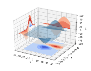
This powerful library definitely had to be included on the list. Matplotlib is a Python-based plotting library that's capable of producing a multi-platform variety of quality figures in different formats. It can be used with Python code, Jupyter Notebook, IPython Shell, web applications, and toolkits. Its goal is to empower the user with strong graphical generating capabilities. Common visualizations can be generated with ease - plots, histograms, bar charts, spectra, scatterplots, etc. can all be achieved with just a few lines of code. Here are some examples in a thumbnail gallery. Complex visualizations can also be achieved with this tool since it's capable of generating 2D, and even 3D plots using the mplot3d toolkit. Here are some examples of plots this tool can generate. There's also a 2.0 version of Matplotlib that allows users create similar or more advanced visualizations, but with more ease than the former 1.0 version. A step-by-step user guide for this version can be found here.
Learn more: There are many examples, plugins, and toolkits available - including third-party libraries that have higher level plotting capabilities. Here are some animation examples.
Chart.js
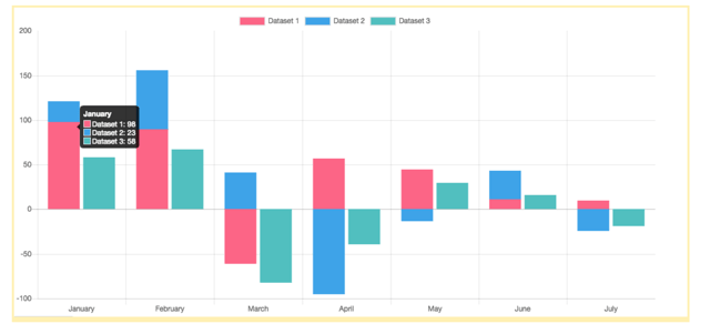
Another open source Javascript-based library is Chart.js. It's a small, easy to use library that delivers customizable, interactive, and flexible charts. It only has eight chart types, which can be a drawback if you're looking for something more sophisticated; however, the types offered are very commonly used and can serve most cases. In the 2.0 version, it's possible to mix and combine different chart types. All charts are rendered on an HTML canvas, and have a flat and responsive design, which allows for adaptability and perfect scaling. Charts can also be animated in the 2.0 version, which means they can support user interaction. This is a perfect tool for small projects, as well as those starting to become familiar with data visualization development.
Learn more: Here, you can find the tool source code and documentation. You can even find a list of popular extensions and plugins, including code integration with Angular, React, Django, Vue.js, and Java.
R Project
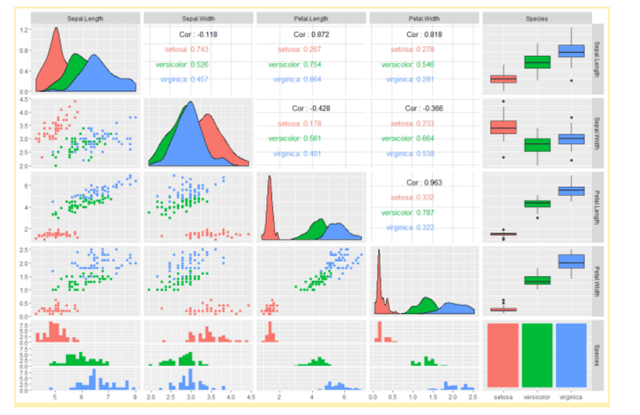
R is a language and environment for statistical computing and graphics, and is also a GNU project. It's really powerful because it's highly extensible and provides a wide variety of statistical and graphical techniques including linear and nonlinear modeling, time-series analysis, and classification and clustering algorithms. It can easily be used to produce good-quality plots, including mathematical symbols and formulae. There are thousands of add-ons on the web, and it can be used for creating mappings, dashboards, and interactive web visualizations. The downside of R is that it has a text-only interface run from command line, which is a restriction not all users are comfortable with. It also requires some knowledge of statistics in order to be properly used.
Google Charts
Another interesting alternative is Google's tool for data visualization called Google Charts. It provides a simple interface, but is also interactive and flexible enough to allow for adaptations to your data presentation requirements. It provides a visualization API containing many chart options for multipurpose data presentations, including diagrams, maps, tables, timelines, and some others charts. Some cool features are that it can be easily embedded into your spreadsheet and website, and it also easily allows for icon creation, such as this Google-o-meter. Its documentation is also really complete and intuitive, which is a plus. The drawback is that you don't have access to the underlying code, which may result in a lack of flexibility that would be required in certain cases.
FusionCharts
FusionCharts Suite XT, which is built with Javascript, offers one of the biggest arsenals of data visualization elements, composed of a total of 90+ types of charts and widgets, as well as 1000+ different maps. Although listed for developers, they come with smart defaults, which means you can quickly build really descriptive charts in a short amount of time. Their charts are also highly customizable supported on all major browsers. It offers extensive documentation, as well as a complete API reference - here, you can find many live code samples for inspiration. The drawback is that it's not a cheap software to purchase, but you can obtain a free trial version with no feature restrictions which can also be installed as npm and bower packages. To learn more, you can find the project documentation here.
For Non-Developers
Microsoft Power BI
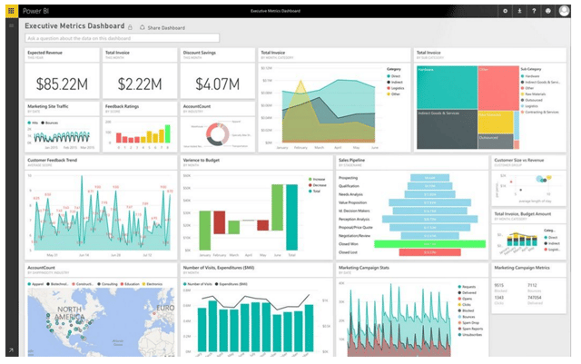
Power BI is a business intelligence general platform from Microsoft that tries to offer a complete data workflow, from data cleaning to data visualization, without requiring any development knowledge. Its web service includes support for streaming data and scheduled data updates, and it's designed for robust data analysis as well as offers a drag-and-drop interface for creating visualizations, reports, and dashboards. It also has extensive database connectivity, thus making it flexible enough to connect with many types of databases. It offers an experience similar to Microsoft Excel, so if you're an Excel user, you'll pick it up pretty quickly. It has a desktop version that's free to use, and users can use its web service for publishing public visualizations, with a capacity limited to 1GB per user.
Here are some of the drawbacks. First, it's not easily customizable and is considered to be a bit limited compared to other tools. Also, its desktop version is limited for Windows users since the web browser allows any OS, but doesn't allow private visualizations on the free account. Finally, if you require many different use cases and user profiles that require customization, Power BI is not the best solution. However, PowerBI is still under development, and there are new features being added monthly.
Plotly.js
Built on top of D3.js and stack.gl, Plotly.js is a web service based visualization tool that allows the user to easily create interactive data visualization charts. It ships many different chart types such as statistical graphs, SVG maps, density plots, and even 3D charts. The charts are fully customizable, and they are declaratively described as JSON objects, which is what makes it universal and browser-based. The charts support zoom, pan, hover, and click interactions as well. A free account includes support for an unlimited amount of public files; however, it only supports one private file. If you want to learn more, feel free to go on to their help center.
Google Fusion Tables
This tool from Google offers one of the simplest ways to generate data visualizations from many different formats. Users can select many options for generating visual reports, such as maps, tables, line charts, bar graphs, scatter plots, pie charts, and many others. Easy to create and easy to share, Fusion Tables offers a fast way for non-techies to quickly create visualizations and spread them over the web. It also includes support for geographic information system (GIS) functions to analyze data by geolocation. On the other hand, it offers very limited support for visualization, so more advanced users won't get the most out of this tool. If you're interested, there's a 3-minute tutorial on how to create a map using Fusion tables as well as a Help Center and a visualization example gallery.
Qlik Sense
Qlik Sense is a multipurpose BI tool that's capable of performing both data cleaning and data visualization, which allows the creation of reports as well as dashboards designed for business demands. It has a responsive interface, which makes it mobile and tablet friendly. It doesn't require technical skills which makes it easy to use, and has a fairly robust engine which allows it to generate visual content efficiently. It can be fully customized, offering a complete set of standard APIs for building rich applications, and has the ability to create custom dashboards which enable the user to centralize information from multiple sources.
One cool aspect is that is has a pretty wide data integration range such as with REST, Salesforce, Apache Hive, and many other data types. Besides robust data integration, it also has data cleaning and transformation tools which eliminates the need for external tools for data transformation. It has a free Windows-based desktop version, which is designed for personal use, and also has a free cloud-based solution, Qlik Sense Cloud, which is free for sharing with up to five users. More on that can be found in these tutorial videos.
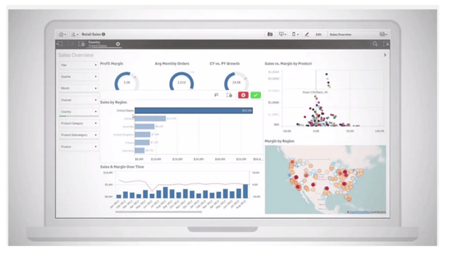
Tableau Public
Tableau public is a free service that allows users to publish interactive data visualizations on the web. It offers good drag-and-drop support for data visualization that can be easily created without any development expertise. It's customizable and offers the ability to create interactive dashboards that combine multiple visualizations in a single view, called 'viz'. This centralizes the information, which can then be easily shared and embedded onto a web page. You can easily perform data calculations within their application, and a free public account has up to 10GB of storage. The drawback here is that your data will be public, so if your data is sensitive, you should resort to another free option. Here's an FAQ with answers to common questions.
What's Next?
Ok! So for the readers that made it all the way to the end, here's the cherry on top. Let's make some predictions on data visualization fields based on our experience and expertise. One possible motive is developing software that can help automate the data visualization procedure. This means users can generate more complex visualizations with less effort. As we're entering a new, digital age, business users want more than simple line and bar charts. They're eager for more complex, robust visualizations as opposed to long bodies of text.
With that said, another possibility in the near future of data visualization, is interactive media. Nowadays, we can already see some interaction with filters combined with DOM events that allow the end user to modify to some degree. In the future, however, the expectation is not just to be able to filter through sensitive information, but also to be able to target detailed points of interest with little effort. Finally, we expect the outcome of more visualization tools that allow us to make meaningful insights from Big Data. These novel tools must have more power in order to generate reports for non-technical workforces on the top of big data. These data visualization tools must be capable of making it easier for employees to rapidly determine new things in the ever-increasing datasets.
References
Machlis, Sharon. “22 free tools for data visualization and analysis.” Computerworld, 25 May 2017.
Hoppe, Geoff. "22 Free and Open Source Data Visualization Tools to Grow Your Business." Clapterra blog, 7 June 2017.
Sharma, Nishith. "The 14 best data visualization tools." Design & Dev, The Next Web, 21 April 2015.
Bierly, Melissa. "10 Useful Python Data Visualization Libraries for Any Discipline". Mode, 8 June 2016.


