VueJS is a top JavaScript framework with an extensive library, but there are several reasons you'll want to know how to create your own custom components. Here's how to get started.

Introduction

VueJS has been, for quite some time, one of the top three frontend JavaScript frameworks. Its environment has grown to encompass a great number of libraries, from complex ones with a myriad of components to simple ones built to speed up particular tasks encountered in day-to-day development. With this in mind, you might be wondering why you would want to develop your own base components, such as buttons, dialogs, input texts, etc., when you can import it all. There are four answers to this question.

  1. You'll get a better understanding of how components are built under the hood;
  2. You'll be able to implement them in your own unique way, with some characteristics that other libraries might not have;
  3. You'll learn some cool CSS tricks and be able to give your components your own colors;
  4. You may be able to build your own library and put it out into the world.

For our first component, let's make a responsive navigation dialog with some neat transitions.
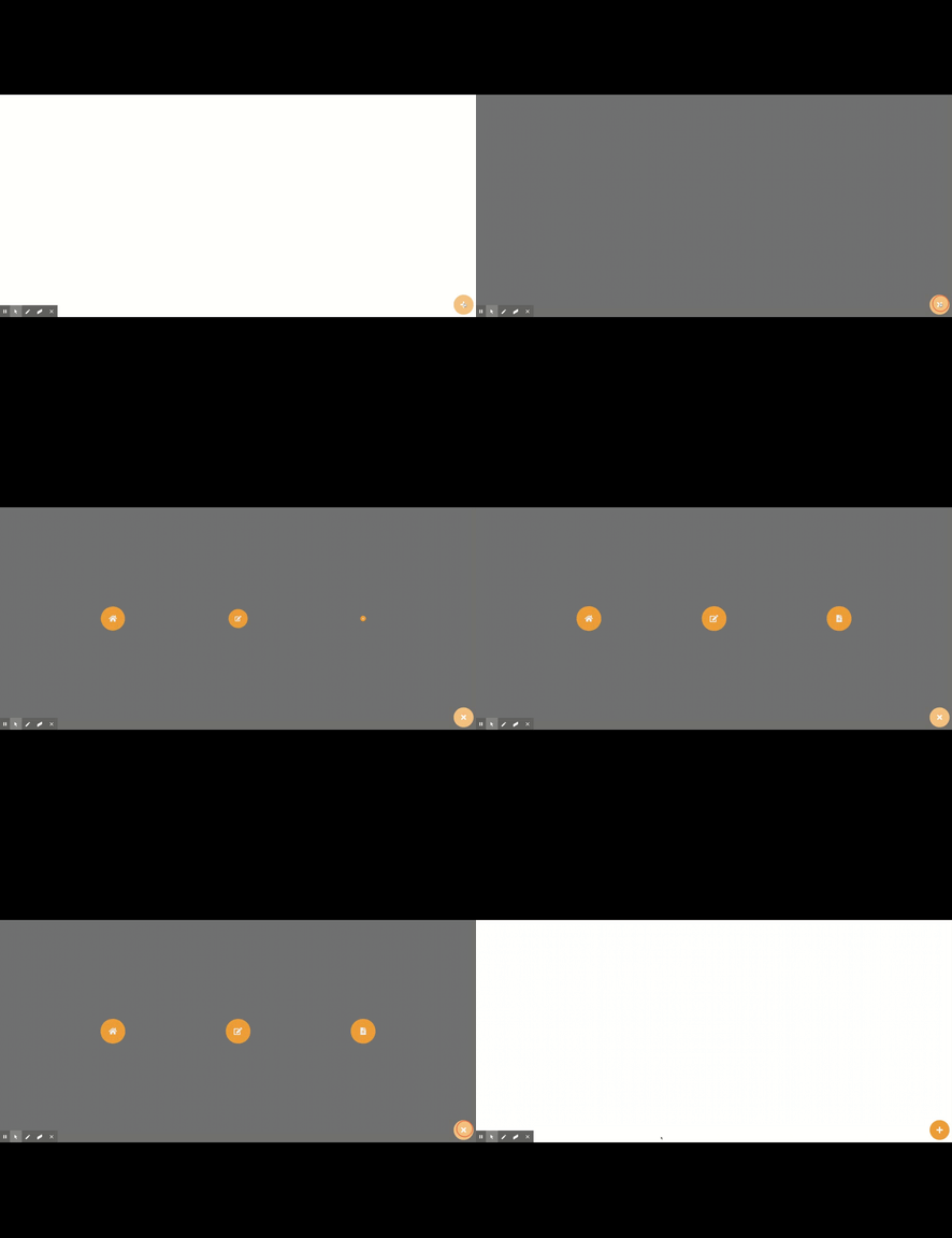
navdialog


Button Component

Let's start by creating the button component:

<template>
   <div class="button" @click="action">
       <i class="fas" :class="icon"></i>
   </div>
</template>
 
<script lang="ts">
import { Component, Vue, Prop } from 'vue-property-decorator';
 
@Component
export default class Button extends Vue {
 
   @Prop({default: ''}) public icon!: string;
 
   action() {
       this.$emit('action');
   }
 
}
</script>
 
<style lang="scss" scoped>
.button {
   height: 80px;
   width: 80px;
   position: fixed;
   bottom: 0;
   right: 0;
   z-index: 98;
 
   & > i {
       color: rgba(255, 255, 255, 1);
       font-size: 30px;
      
   }
 
   display: flex;
   align-items: center;
   justify-content: center;
   background-color: rgba(245, 160, 50, 1);
   height: 80px;
   width: 80px;
   border-radius: 40px;
   position: absolute;
   bottom: 10px;
   right: 10px;
   cursor: pointer;
 
   &:hover, &:active {
       background-color: rgb(250, 195, 124);
   }
 
}
 
</style>

Both <template> and <script> tags are pretty straightforward, just note the @click on the <div> and the action() method. Through those two parts of the code, we pass the responsibility of implementing the action for the button click to the component using it.

On the <style> tag, we add the classes necessary to shape our button. We could create props for specific properties, such as color, background-color, width, and height, but for the purpose of this article, we will skip this step.

DialogItem Component

Our next step is to create a DialogItem, which will provide the icons the user needs to navigate, open another modal, etc.

<template>
   <div
       class="icon item"
       :class="{'show': show}"
       :style="'width: ' + itemSize + '; height: ' + itemSize + '; transition-delay: ' + animationDelay + 's'">
       <i
          v-if="icon"
          class="fa"
          :class="icon"
          :style="'font-size: ' + iconSize"/>
       <span v-if="!iconOnly"></span>
   </div>
</template>
 
<script lang="ts">
import { Component, Prop, Vue } from 'vue-property-decorator';
 
@Component
export default class DialogItem extends Vue {
 
   @Prop({default: ''}) public name!: string;
   @Prop({default: ''}) public icon!: string;
   @Prop({default: '1.2rem'}) public iconSize!: string;
   @Prop({default: '80px'}) public itemSize!: string;
   @Prop({type: Boolean}) public iconOnly!: boolean;
   @Prop({default: 'false'}) public show!: boolean;
   @Prop({default: '0'}) public animationDelay!: string;
 
}
</script>
 
<style lang="scss" scoped>
.item {
   display: flex;
   flex-flow: row;
   align-items: center;
   justify-content: center;
   border-radius: 50%;
   background-color: rgba(245, 160, 50, 1);
   color: #EEE;
   cursor: pointer;
   z-index: 110;
   pointer-events: all;
 
   &:hover, &:active {
       color: #333;
       background-color: rgb(250, 195, 124);
   }
 
   &.icon {
       transform: scale(0);
   }
 
   &.icon.show {
       transform: scale(1);
       transition: transform 0.5s;
   }
 
}
</style>
 

In the <script> tag, we have some props for the implementing component to customize our icons, passing them through inline dynamic style:

  1. iconSize: fontawesome icon’s font-size;
  2. itemSize: component’s width and height;
  3. iconOnly: value to indicate if we want only the icon to be displayed;
  4. animationDelay: value in seconds for the animation’s start delay.
We also have a control prop:
  1. show: value to indicate rendering of a specific class to hide/show our component.

In the <style> tag, we can build our transition to animate the dialog opening using the transform property, scaling the component from 0 to 1 in 0.5s with transition.

There are two other properties to point out: z-index and pointer-events.

  1. z-index: Puts our component in front of others with a lower z-index value. The default is 1.
  2. pointer-events: Makes our component clickable. It is the default behavior, but we are explicitly putting it here because we will use a different value in the component implementing the DialogItem.
Backdrop Component
Now we need to create a Backdrop component in order to have an opaque background to prevent the user from clicking anything but the dialog.
<template>
   <div class="backdrop" :class="{'show': show}" @click="action"></div>
</template>
 
<script lang="ts">
import { Component, Prop, Vue } from 'vue-property-decorator';
 
@Component
export default class Backdrop extends Vue {
 
   @Prop({default: false}) public show!: boolean;
 
   action() {
       this.$emit('click');  
   }
 
}
</script>
 
<style lang="scss" scoped>
.backdrop {
   width: 100%;
   height: 100vh;
   background-color: rgba(0, 0, 0, 0.60);
   position: fixed;
   top: 0;
   left: 0;
   opacity: 0;
   z-index: -1;
 
   &.show {
       opacity: 1;
       z-index: 1;
   }
}
</style>
 

This component is also pretty straightforward, with only one important point: the change from opacity and z-index when the show class is added to the root element, “rendering” it on the screen.
Dialog Component
With our DialogItem and Backdrop done, we need to implement the navigation dialog itself in the Dialog component:
<template>
   <div>
       <div class="dialog" :class="{'show': show}">
           <template v-for="(icon, index) in dialogIcons">
               <app-dialog-item
                   :key="icon.name"
                   :name="icon.name"
                   :icon="icon.icon"
                   iconOnly
                   iconSize="30px"
                   itemSize="100px"
                   :show="show"
                   :animationDelay="(index + 1) * 0.15"/>
           </template>
       </div>
       <app-backdrop :class="{'show': show}" @click="closeDialog"/>
   </div>
  
  
</template>
 
<script lang="ts">
import { Component, Prop, Vue } from 'vue-property-decorator';
import DialogItem from './DialogItem.vue';
import DialogIcon from './DialogIcon';
import Backdrop from '../Backdrop/Backdrop.vue';
 
@Component({
   components: {
       appDialogItem: DialogItem,
       appBackdrop: Backdrop
   }
})
export default class Dialog extends Vue {
 
   @Prop({required: true}) public dialogIcons!: DialogIcon[];
   @Prop({default: false}) public show!: boolean;
 
 
   closeDialog() {  
       this.$emit('onClose');
   }
 
}
</script>
 
<style lang="scss" scoped>
.dialog {
   display: flex;
   flex-flow: column;
   justify-content: space-evenly;
   align-items: center;
   height: 100%;
   width: 100%;
   position: fixed;
   top: 0;
   left: 0;
   opacity: 0;
   z-index: -1;
   pointer-events: none;
 
   &.show {
       opacity: 1;
       z-index: 100;
   }
 
   @include sm {
       flex-flow: row;
   }
 
 
}
</style>

In this component’s <script>, we only have two properties:

  1. dialogIcons: array of DialogIcon containing the name and icon values;
  2. show: value to indicate rendering of a specific class to hide/show our component.

In the <style> tag, we implement the direction of the dialog icons with display: flex and flex-flow: column, and we keep them evenly spaced with justify-content: space-evenly. One important thing to notice is that we do not remove the component from the dom or change its display to none when it is hidden; we simply put its opacity to 0 and its z-index to -1, making it invisible and unclickable. We do that because if we took one of the other approaches, the transition would not be shown.

To wrap up this component, we add a @include through a mixins.scss file created with media queries to change the direction of the icons when the screen is small, using flex-flow: row.

Layout Component

To illustrate the usage of the component, we build a simple Layout component to implement our dialog and button.

<template>
   <div>
       <app-dialog :show="showDialog" :dialogIcons="dialogIcons" @onClose="closeModal"/>
       <app-button v-if="!showDialog" icon="fa-plus" @action="openModal"/>
       <app-button v-else icon="fa-times" @action="closeModal"/>
   </div>
</template>
 
<script lang="ts">
import {Component, Vue} from 'vue-property-decorator';
import Button from '../UI/Button/Button.vue';
import Dialog from '../UI/Dialog/Dialog.vue';
import DialogIcon from '../UI/Dialog/DialogIcon';
 
@Component({
   components: {
       appButton: Button,
       appDialog: Dialog
   }})
export default class Layout extends Vue {
 
   public showDialog = false;
   public dialogIcons: DialogIcon[] = [];
 
   created() {
       this.dialogIcons = [new DialogIcon('Home', 'fa-home'), new DialogIcon('Post', 'fa-edit'), new DialogIcon('Reports', 'fa-file-alt')];
   }
 
   openModal() {
       this.showDialog = true;
   }
 
   closeModal() {
       this.showDialog = false;
   }
 
}
</script>
 
<style lang="scss" scoped>
 
</style>

And with these final steps, we have finished implementing our custom Navigation Dialog component. We still have to implement the routing logic, but the structure is all set and done.
Conclusion

There are a lot of ways to implement the same behavior we created here, and I welcome you to share yours with us. Also, if you have any questions or suggestions, please feel free to leave a comment!

Reference

The complete code for this component may be found here.


Author

Felipe Di Bernardi S Thiago

Felipe Di Bernardi S Thiago is a Java Fullstack Developer at Avenue Code. He is an aspiring software architect and a VueJS enthusiast with a love for CSS.


What are CSS Custom Properties

READ MORE

How to Build Your Own Facial Recognition Web App

READ MORE

4 Ways to Make Your Angular App Sustainable and Scalable

READ MORE