
Those who enjoy surfing the internet and admire the beauty in websites have almost definitely noticed the introduction of a new design concept: the parallax. The parallax itself is a technique that explores component independent movement, creating astonishing 3D visual effects in the page. This effect relies heavily on the scrolling event, where each component can move at different velocities - during the scrolling - in order to grab users’ attention and direct it to a certain area/information. But what types of parallaxes exist? Why and where should we use them? These are a few questions we'll try to answer in this article.
A little bit of history
The parallax effect is actually not really new. According to Wikipedia, "the technique grew out of the multiple camera used in traditional animation since 1930s". Its popularity, though, came from the 2D computer graphics in the 1980s, which brought the illusion of a character being moving along with a background scenario as seen in the picture below:
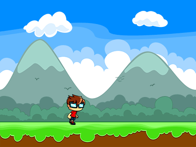
Figure 1: Parallax effect for 2D games (source)
In this example, the mountains, sky and clouds in the background are moving more slowly than the small boy running in the grass. This effect creates the illusion in our eyes that our character is actually running and moving toward.
But when was the parallax effect first introduced to the web? According to Carla Dawson, the web first saw a parallax in 2011, when Ian Coyle created the very first parallax website for Nike, entitled "Nike Better World" (This article presents a case study of the website) . This event shone a spotlight on parallax. Web designers started to consider the technique, which became a trend in 2013 onwards, according to the graphic below:
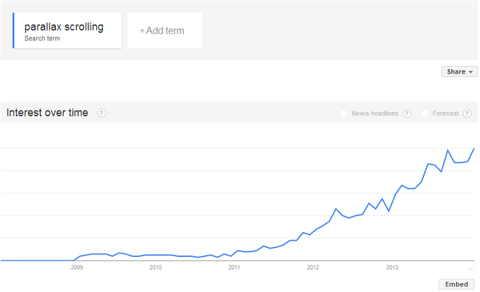
Figure 2: Graph showing parallax use in websites tendency. (source)
But what is it for?
As mentioned earlier, the parallax is used to draw users’ attention to an area or concept on the website. Its strong appeal for motion is often used to stress some important information, such as a product in clearance, for example.
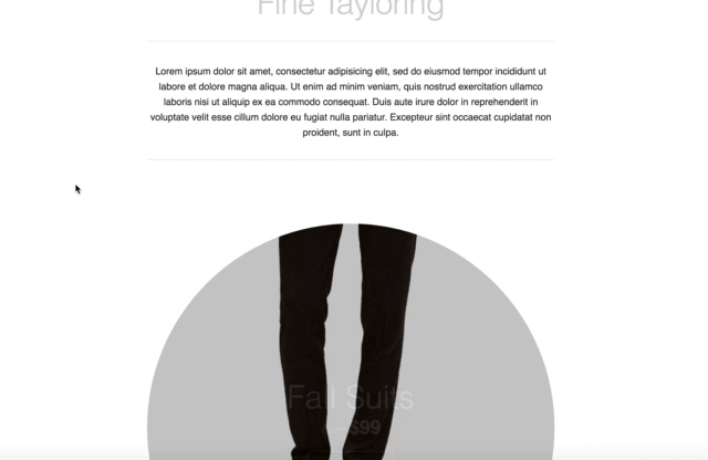
Figure 3: Scrolling down the page to review the suits discounts
In Figure 3, as the user scrolls down the page, the promotional discount information appears in a way that can't be missed. It's a huge alert to attract the customer's attention to the product on sale.
It is also often used to keep the user interested in a whole company/product landing page, since it forces the user to scroll the page down to the bottom by piquing his curiosity. A third example is for sites that are supposedly trying to tell you a story. An amazing storytelling example is flattvrealism. The user is always motivated to scroll down to the bottom so he knows the end of the story.
Contraindications
Parallaxes are great, but of course there always setbacks we should be aware of. Parallaxes can have the following cons:
- Complexity of development;
- Performance issues;
- SEO considerations
Depending on the parallax we are trying to create, the complexity level can be very tricky, since we are dealing with scrolling events. Knowing exactly when and where to trigger the action is not always easy, especially for the storytelling examples, such as http://www.flatvsrealism.com/. Besides, if the parallax is not well designed, it can cause the website to be confusing and unclear to the user.
Another point to consider is performance. Depending on the project, the loading time can become a real issue because of the time to load so many images. Besides, we have to consider we are always listening to the scroll event, which may increase the use of CPU and memory, which is not always good when dealing with, for example, mobile devices.
Lastly, since the idea is to keep scrolling, the tendency is to keep developing single page websites, which can be a problem for SEO tools, since the number of pages can vote up your website in Google searches.
We should always be aware of these 3 considerations when we decide to make use of the technique in our websites. Performance and SEO are always important priorities.
What are the main types of parallax
Since the parallaxes rely on the scroll event, many kind of effects can be applied. In this article, we'll cover the 4 most commonly used cases and come up with examples for each one. The parallax names seen in this article are not official. The idea was to come up with easy-to-memorize names that define with words what the parallax does. Here is the list:
1. Header Parallax
Probably the most popular parallax on the web. It is mainly used on landing pages, and creates the effect of layers being overlapped. It is reminiscent of a letter being pulled out/pushed into an envelope.

Figure 4: Header Parallax in action
In the Figure 4, we can see one example of the Header Parallax in action. The hero area, which is the darker portion in the page is being covered during scrolling by the white section below it. It's a great effect and relatively easy to achieve if compared with other types.
2. Reveal Parallax
The reveal parallax is another example extensively used over the internet. It consists of revealing the content only when the user scrolls down to that point. Normally, that area will be hidden and only when the user get up to a specified point, the content will show up. An example can be seen below:
.gif?width=480&height=412&name=giphy%20(1).gif)
Figure 5: Revealing parallax example
In the Figure 5, we can see that the footer (the black area) is not shown by default. As soon as the user scrolls down to a specified area, the footer starts to show up. It's the same illusion of opening the curtains from a theater to delight the crowd with a play.
3.Lazy loading Parallax
In this case, the web designer wants to maintain the user focused on the items the website has to offer. It also communicates to the user the idea of continuation. The website tries to say: "there are more items to come. Keep up scrolling, but check out my items". Items in this case could be products, talks, lessons or whatever is important to the business group. Below, we have a example from the TEDxPortland website:
.gif?width=480&height=342&name=giphy%20(2).gif)
Figure 6: Lazy loading images parallax
In Figure 6, the TED talks are being shown as the user scrolls. As mentioned earlier, it gives the idea of continuation. There are more items (talks) to come. The talks are what we want you to be focused on. Keep scrolling!
4.Landing Parallax
The landing parallax consists in drop content in the page as the user scrolls. The difference between the landing and the lazy loading parallaxes is that the way the components are displayed in the page. In the lazy loading method, we are only displaying the elements in a fixed position. The elements are basically fading in/fading out. However, in the landing parallax, the elements are moving from an origin position and dropping to an end position as the scrolling goes on. The effect can be seen in Figure 7:
.gif?width=480&height=336&name=giphy%20(3).gif)
Figure 7: Landing parallax in action
Here the elements don't have a fixed position where they will only show up. They need to come from a direction and move toward a destination. It's one of the most appealing methods and it can cause a very good impression, depending on the animation's complexity level. The example above was taken from a storytelling parallax website. It can be reached through the url http://www.albinotonnina.com/. Here the the website's owner tries to retain the user’s attention on his resumé by making use of several interesting animations controlled by the scroll event.
Other great examples
Great examples of parallaxes can be easily found over the internet. Each website shows great work and user experience. It's worth to take some inspiration before starting our own project. Below is a list of selected amazing parallax websites:
http://www.flatvsrealism.com/
http://www.albinotonnina.com/
https://www.spotify.com/br/
http://antonandirene.com/
http://time4.online/
Conclusion
Over the years, many techniques and resources came to make the web experience more and more friendly and effective. As we can see, parallax is very important for creating incredible visual effects capable of maintaining user focus on what is most important in a website. The importance of doing that is to increase the conversion rate no matter what kind of business the website has to offer so the company/professional can always grow. In a subsequent article we'll explore each one of the parallaxes types described in practice. We'll develop a website using all the examples. Stay tuned!


