
About a year and a half after reaching 1 billion active users, Facebook hit another milestone: over 1 billion active mobile users. Mashable, one of the biggest sources of content about social media, internet news, and digital innovation, published a survey stating that 17.4% of all web traffic comes from mobile devices. This survey was published in 2013, since which time the percentage has steadily crept upward yearly.
Social networks like Tumblr are changing features formerly found only on websites for desktop to mobile platforms, synchronizing both contexts. Another study, also published by Mashable, shows that 65% of all time spent on social networks is from mobile devices.
According to a 2014 report from IBM, "for the first time, online traffic from mobile devices outpaced traditional PCs on Thanksgiving day"; according to a 2015 study from ComScore, mobile devices "account for 60 percent of digital media time spent". Already in 2016, according to this article, "30% of all online shopping purchases now happen on mobile phones".
All of these articles point to the same fact: the reasons to apply the concept of responsive design are many, and they are only growing.
Understanding the concepts
Developing websites (or any web application) with a flexible and adaptable layout and context, capable of responding to a large variety of screen resolutions, devices and contexts, is called Responsive Web Design.
Imagine the difference between a device whose screen is 320px wide and another device with a screen side of 1024px. The space left by the difference of size is too large to simply stretch the layout, adapting the content to the available space. Leaving a rough blank space is even worse. Clearly, this is a case for responsive design. Some techniques allow us to offer the final users a much better experience, adapting ourselves in a really significant way to each type of device.
Mobile First
When planning for responsive design, we define the basis of the application design for a given screen size, and from there we can adapt the content progressively to different screen sizes, applying different design rules. These rules are directly linked to the size of the screen, since they may restrict certain features of the web site. For instance, displaying a heavy image gallery can provide a poor user experience on mobile devices.
Hiding or displaying sections of the web site, reducing the size of images or adjusting font size so that the page has no horizontal scrolling, and ensuring that no piece of the content is superimposed - or even exchanging a horizontal menu with a vertical selection box - all are examples of design rules that can be manipulated to allow the application to respond to available screen size. The impact to user experience cannot be overstated, especially on devices with smaller screens.
When we decide to apply this concept, we need to begin somewhere and therefore need to decide what the focus is. One option is to begin the planning by considering the restrictions of mobile devices. Mobile first, then, means that the basis of design as explained above, is defined for the smaller screen sizes found on mobile devices. In other words, begin by developing the application with an iPhone 4S (320 x 480) in mind. By focusing first on the limitations imposed by mobile devices, we can more easily develop adapted versions for larger screens, graduating to tablets, desktops, and even smart TV's. This is mobile first.
Hands On
So how do we go about creating responsive design? Below we'll explore 5 basic techniques to implement responsive design, focused on mobile first. This article will stick to fairly basic methods.
1. Change the box-sizing
In an HTML page, each element is represented as a rectangular box, which is interpreted by the browser using the standard box model (CSS box model). This model determines the content of the space occupied by an element, which is to say, the ratio of the element and its content to its attributes of margin, padding and border.
The CSS property box-sizing is what defines how this box model will behave in relation to its size and spacing measures. The default of the browser is the content-box, which considers the original size (width, height, etc.), added to the spacings (padding, margin, etc).
 But the way the
 box-sizing: content-box works is not intuitive. If we want an element to occupy 50% of the screen with a border of 5px and, therefore, define width: 50%; border-width: 5px; the result will be somewhat more complicated, because the final width of this element will be equal to 50% of the screen width added to the 10px edge. If the screen has 100px, the result would be 60px width for the element.
Therefore, it's important to make sure all the elements have their box-sizing as border-box, which will prevent the size of all properties from being added to the width defined for the element.
*, *:before, *:after {
    -webkit-box-sizing: border-box;
       -moz-box-sizing: border-box;
            box-sizing: border-box;
}
2. Convert the typography
To get the result of a fluid layout, we need to use the relative measures (%, em, rem, vw, vh), which provide fluidity to the site when the screen size or font are changed. We use each of these units of measurement as follows:
-
PX: absolute measure used for immutable values such as
background,text-shadowand htmlfont-size. -
%: classified as data type and not units of measure by the W3C specification. Used in containers (
section,article,div), fluid grids, and images. -
EM: relative distance unit, calculated in relation to another unit of measure. Its value is relative to the size of the parent element font (i.e., an element with
font-size: 2em;will be twice the size of the parent element source, whatever it is). This is used infont-size,margin,padding. Unlike percentage, theemis a fixed value like the pixel, but its value is calculated from the value of another element. -
REM: like the
em, it is a relative distance unit. Its value is relative tofont-sizedocument's root (i.e., an element withfont-size: 2rem;will have twice the font size of the document root element, which may be thehtmltag or thebodytag, depending on the CSS rule that was applied). Also used in fonts, margins and paddings,remdoesn't work in some versions of Android and IE <9. -
VIEWPORT UNITS (
vw,vh,vmin,vmax): used in containers, grids, images and even fonts. This is a truly flexible and adaptable unit. Thevhis equal to one percent of the viewport (size of the browser screen) height. For instance, if the browser height is640px,1vhis equal to6.4pxand, in the same way, if the viewport width is320px,1vwis equal to3.2px.
It is necessary to convert the typography following the specifications above. For instance, we will apply the font-sizeof 16px in the body and adapt our fixed units using the following calc: SIZE ÷ CONTEXT = RESULT, as shown in the example below:
Before:
h1 { font-size: 24px; }

h1 span { font-size: 18px; }
After:
body { font-size: 16px; }

h1 { font-size: 1.5rem; }
/* 24 ÷ 16 = 1.5 */

h1 span { font-size: 1.125rem; }
/* 18 ÷ 16 = 1.125 */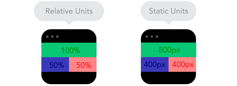
3. Set the Viewport
The viewport is the screen visible area of the device, where the website is displayed. The viewport customization allows us to define the visible initial resolution of the website, and avoid its miniaturization.
<meta name="viewport" content="width=device-width, initial-scale=1">
In the below example I suggest a more complete configuration, disabling the zoom feature, and assuming that the user will never need this feature (use with caution).
<meta name="viewport" content="width=device-width, initial-scale=1, maximum-scale=1, user-scalable=no">
4. Define Break Points
Media Queries are conditional expressions to apply different CSS styles, depending on certain rules such as the viewport width. Through its use, we define points of considerable changes in the layout of the page. For instance, displaying a certain element only to devices with big screens, like a desktop.
/* Extra small devices (phones, less than 768px) */
/* No media query since this is the default in Bootstrap */
#banner { display: none; } /* banner not displayed */

/* Small devices (tablets, 768px and up) */
@media (min-width: 768px) { ... }

/* Medium devices (desktops, 992px and up) */
@media (min-width: 992px) { ... }

/* Large devices (large desktops, 1200px and up) */
@media (min-width: 1200px) {
    #banner { display: block; } /* banner displayed only for desktops */
}
Beyond the size rules we saw above, we can also define rules for device orientation, screen aspect ratio, or even resolution, among others.
/* Devices on portrait mode */
@media all and (orientation:portrait) { ... }

/* Devices with screen size like 1280 horizontal pixels and 720 vertical pixels  */
@media screen and (device-aspect-ratio: 16/9) { ... }

/* Devices with resolution greater than 300 dots per inch */
@media print and (min-resolution: 300dpi) { ... }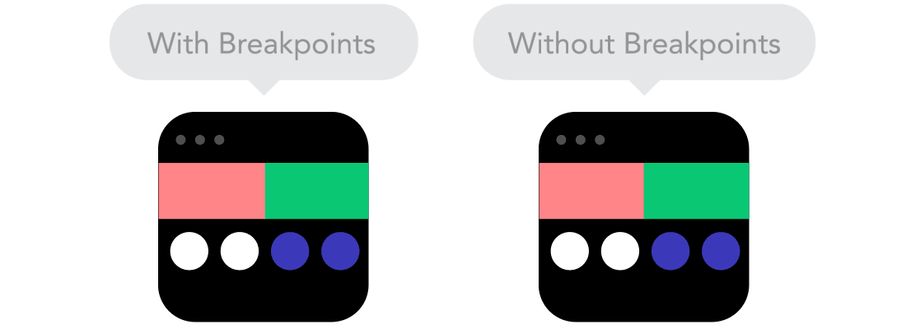
5. Use SVG for images
SVG stands for Scalable Vector Graphics. It is an XML language for describing in a vector shape drawings and two-dimensional graphics, either statically, dynamically or as an animation. We can incorporate SVG in the website responsively using the object tag in order to provide an image alternative to browsers that don't support SVG.
<!--?xml version="1.0" encoding="utf-8"?-->

<svg version="1.1" id="Layer_1" xmlns="http://
www.w3.org/2000/svg" xmlns:xlink="http://
www.w3.org/1999/xlink" x="0px" y="0px" viewBox="0 0 80 80" \="" enable-background="new 0 0
80 80" xml:space="preserve">
    <circle fill="#682A68" cx="40" cy="40" r="40"></circle>
    <polygon fill="#FFFFFF" points="39.136,15.483
    45.049,33.682 64.186,33.682 48.704,44.93
    54.615,63.127 39.136,51.881 !
    !23.655,63.127 29.568,44.93 14.087,33.682
    33.223,33.682 "></polygon>
</svg>
<object data="your-svg-image.svg" type="image/svg+xml">
  <img src="your-fallback-image.jpg">
</object> 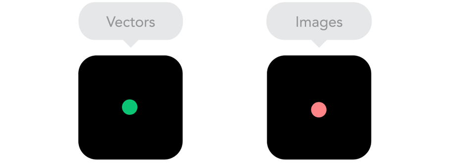
Conclusion
These are just a handful of basic techniques, and there are plenty more! Some other techniques to develop responsive design focused on mobile first worth checking out are user agent, HTML 5 tags, Responsive Navigation and many others. My recommendation is to use one of these two CSS frameworks: Bootstrap or Foundation, and to take some time to read this informative article from Smashing Magazine.
Now it's up to you! Keep studying, keep practicing and if you find any cool technic to implement responsive design, come and share it with us!


